Hello,
Heatmap is one of the most frequently visualized method on SCI papers.
This is the method how to heatmap visualize in Rstudio.
1. Install Packages
# Install Library
install.packages("stats")
install.packages("gplots")
install.packages("RColorBrewer")
2. Run Packages
# Loads Library
library(stats)
library(gplots)
library(RColorBrewer)
3. Set the Heatmap color
# Heatmap color
scalegreenbluered=colorRampPalette(colors=c("white","chartreuse4","darkgreen","black"))(256)
colors=c("white", "chartreuse4", "darkgreen", "black")
My case, i selected white, green, darkgreen, and black color.
Fill in the low value from left to high value at right.
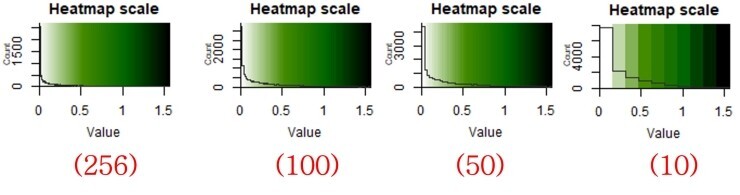
(256)
The number "(256)" is higheset value. This means how many times will you divide colors.
See the below divided colors from 10 to 256.
Now, i belive you understood until here.
4. Input Data
4.1 Check data format
This is the data format below.
You can check column and row data format by run below command.
# Data forma
B = matrix(
# Taking sequence of elements
c("bacteria1", "5", "43", 4, 5, "bacteria2", "43", "21", 9, 10, "bacteria3", "53", "32", 14, 15, "bacteria4", "51", "21", 19, 20, "bacteria5", "21", "21", 24, 25),
# No of rows
nrow = 5,
# No of columns
ncol = 5,
# By default matrices are in column-wise order
# So this parameter decides how to arrange the matrix
byrow = TRUE
)
# Naming rows
colnames(B) = c("variable1", "variable1", "variable1", "variable2", "variable2")
# Naming columns
print(B)
The result of data format is in below.
variable1 variable1 variable1 variable2 variable2
[1,] "bacteria1" "5" "43" "4" "5"
[2,] "bacteria2" "43" "21" "9" "10"
[3,] "bacteria3" "53" "32" "14" "15"
[4,] "bacteria4" "51" "21" "19" "20"
[5,] "bacteria5" "21" "21" "24" "25"
4.2 Input data and normalization
# Heatmap Calculation
dat1 <- read.delim("clipboard", row.names=1) #Data input
asinTransform <- function(dat1) { asin(sqrt(dat1)) }
pAsin <- asinTransform(dat1) #Normalization
orderheat <-as.matrix(pAsin)
dat1 <- read.delim("clipboard", row.names=1)
This command will input yourdata from copied dataframe from excel.
When you visualize data values, sometimes normalization is necessary to well understand the differentiation.
I used to Arcsin normalization method.
Left is normalized and right is not normalized below.
This is same data, but you can notice different pattern can color expressions.

5. Calculate Row and Column dendrogram
# Calculation
distance.row = dist(as.matrix(orderheat), method = "euclidean") #Calculation
cluster.row = hclust(distance.row, method = "ward.D")#Calculation
distance.col = dist(t(as.matrix(orderheat)), method = "euclidean") #Calculation
cluster.col = hclust(distance.col, method = "ward.D") #Calculation
6. Visualization Plotting
6.1 Only Row dendrogram
# Row dendrogram Plot
heatmap.2(orderheat, dendrogram="row", trace="none", keysize=1, tracecol = "#303030", cexCol = 0.5, cexRow = 0.7, col=scalegreenbluered, scale="none", margins=c(4,10), sepcolor="white", colsep=c(7, 14, 21, 28, 41, 54), sepwidth=c(0.2), key.title='Heatmap scale', Colv=FALSE)
dendrogram =
You can select here ther dendrogram patterns; only row or both.
cexCol =
Change text size of column
cexRow =
Change text size of row
margins =
Change graph size
sepcolor =
Set division line color of column
colsep =
Set division line location of column
sepwidth =
Change division line size
Below is example result
(The label of Column and Row is erased by default, because of SCI data that published yet).

6.2 Column and Row dendrogram
# Column & Row dendrogram plot
heatmap.2(orderheat, dendrogram="both", trace="none", keysize=1, Rowv=as.dendrogram(cluster.row), Colv=as.dendrogram(cluster.col), tracecol = "#303030", cexCol = 0.35, col=scalegreenbluered, scale="none", margins=c(4,6), key.title='Heatmap scale')
Command explain skip. Same with above.
Below is example result.

7. Create High resolution figure
7.1 Set working directory
# Set working directory
getwd()
setwd("F:/SRA/Output_Figure")
getwd()
7.2 Create High resolution figure Output
# Get Figures with high resolution
tiff(file="heatmap.2.tiff", width = 10, height = 6, units = "in", res = 600)
heatmap.2(orderheat, dendrogram="row", trace="none", keysize=1, tracecol = "#303030", cexCol = 0.5, cexRow = 0.7, col=scalegreenbluered, scale="none", margins=c(4,10), sepcolor="white", colsep=c(7, 14, 21, 28, 41, 54), sepwidth=c(0.2), key.title='Heatmap scale', Colv=FALSE)
dev.off()
'R > R_Usage [Eng.]' 카테고리의 다른 글
| Correlation analysis with R "Hmisc" Package [spearman, pearson] (0) | 2022.11.15 |
|---|---|
| Correlation Plot Visualization "Corrplot" with Rstudio. (1) | 2022.11.15 |
| ANOSIM, Statistical analysis with Rstudio (0) | 2022.11.07 |
| Rstudio_ working directory default setting (0) | 2022.11.07 |
| Microbiome beta-diversity 3D plot in R (mds, pcoa) (0) | 2022.11.03 |