안녕하세요,
많은 논문에서 시각화로 쓰이는 방법 중 하나는 Heatmap이 있어요.
Rstudio에서 data를 Heatmap으로 시각화하는 방법이에요.
1. 패키지 설치
# Install Library
install.packages("stats")
install.packages("gplots")
install.packages("RColorBrewer")
2. 패키지 실행
# Loads Library
library(stats)
library(gplots)
library(RColorBrewer)
3. Heatmap 색 설정
# Heatmap color
scalegreenbluered=colorRampPalette(colors=c("white","chartreuse4","darkgreen","black"))(256)
colors=c("white", "chartreuse4", "darkgreen", "black")
저는 하얀색, 초록색, 짖은 초록색, 검정색으로 설정했어요.
왼 쪽부터 순서대로 낮은 value 에서 큰 value의 색으로 입력하면 되요.
(256)
(256)의 숫자는 색을 쪼개는 횟수이고, 256이 최대치에요.
아래 그림을 통해서 색 쪼갬 횟수를 확인해 보세요.
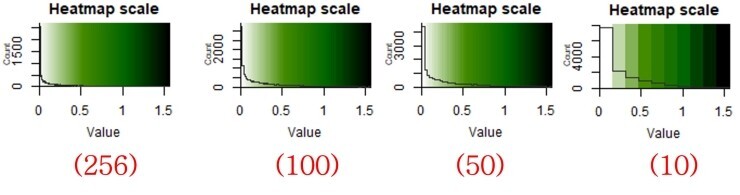
색을 쪼갠 횟수가 10번에서 확연히 차이가 보이시나요?
4. 데이터 불러오기
4.1 데이터 포맷 확인
아래 Data format은 데이터 프레임이에요.
어떤 형태로 데이터가 포맷이 이루어지는지 아래 코맨드를 통해서 결과값을 확인해 보세요.
# Data forma
B = matrix(
# Taking sequence of elements
c("bacteria1", "5", "43", 4, 5, "bacteria2", "43", "21", 9, 10, "bacteria3", "53", "32", 14, 15, "bacteria4", "51", "21", 19, 20, "bacteria5", "21", "21", 24, 25),
# No of rows
nrow = 5,
# No of columns
ncol = 5,
# By default matrices are in column-wise order
# So this parameter decides how to arrange the matrix
byrow = TRUE
)
# Naming rows
colnames(B) = c("variable1", "variable1", "variable1", "variable2", "variable2")
# Naming columns
print(B)
데이터 포맷 명령어 결과는 아래와 같아요.
variable1 variable1 variable1 variable2 variable2
[1,] "bacteria1" "5" "43" "4" "5"
[2,] "bacteria2" "43" "21" "9" "10"
[3,] "bacteria3" "53" "32" "14" "15"
[4,] "bacteria4" "51" "21" "19" "20"
[5,] "bacteria5" "21" "21" "24" "25"
4.2 데이터 불러오기 및 정규화
# Heatmap Calculation
dat1 <- read.delim("clipboard", row.names=1) #Data input
asinTransform <- function(dat1) { asin(sqrt(dat1)) }
pAsin <- asinTransform(dat1) #Normalization
orderheat <-as.matrix(pAsin)
dat1 <- read.delim("clipboard", row.names=1)
명령어는 데이터를 엑셀에서 Copy하고 불러오는 과정이에요.
데이터를 그대로 시각화할 경우 극과 극으로 색표현이 될 수 있기 때문에 정규화 과정이 필요해요.
저는 아크사인 정규분포 기법을 이용해요.
아래 그림은 정규분포화 (왼쪽) 적용한 것과 아닌 것 (오른쪽) 그래프에요.
같은 데이터를 두고도 색표현이 달라지고
차이점이나 패턴 관찰이 더 쉬운 것을 택해서 이용하면 좋아요.

5. Row와 Column dendrogram 계산
# Calculation
distance.row = dist(as.matrix(orderheat), method = "euclidean") #Calculation
cluster.row = hclust(distance.row, method = "ward.D")#Calculation
distance.col = dist(t(as.matrix(orderheat)), method = "euclidean") #Calculation
cluster.col = hclust(distance.col, method = "ward.D") #Calculation
6. 시각화 Plotting
6.1 Row만을 dendrogram으로 시각화
# Row dendrogram Plot
heatmap.2(orderheat, dendrogram="row", trace="none", keysize=1, tracecol = "#303030", cexCol = 0.5, cexRow = 0.7, col=scalegreenbluered, scale="none", margins=c(4,10), sepcolor="white", colsep=c(7, 14, 21, 28, 41, 54), sepwidth=c(0.2), key.title='Heatmap scale', Colv=FALSE)
dendrogram =
dendrogram 패턴을 row만 볼 것인지, both (column과 row) 둘 다 볼 것인지 설정
cexCol =
Column의 글자 크기 조정
cexRow =
Row의 글자 크기 조정
margins =
그래프의 전체 크기 조정
sepcolor =
Column의 구분선 색 지정
colsep =
몇 번째 column에 구분선을 둘 것인지 지정
sepwidth =
구분선의 크기 조정
아래는 예시 결과에요 (Col과 Row의 라벨은 개인 데이터이기 때문에 지웠어요.)

6.2 Column과 Row를 모두 시각화
# Column & Row dendrogram plot
heatmap.2(orderheat, dendrogram="both", trace="none", keysize=1, Rowv=as.dendrogram(cluster.row), Colv=as.dendrogram(cluster.col), tracecol = "#303030", cexCol = 0.35, col=scalegreenbluered, scale="none", margins=c(4,6), key.title='Heatmap scale')
Command 설명은 위에 같은 내용이므로 생략할게요.
아래는 예시 결과에요.

7. High resolution (SCI 논문 제출용) Figure 파일 만들기
7.1 working directory 설정
# Set working directory
getwd()
setwd("F:/SRA/Output_Figure")
getwd()
7.2 High resolution figure 생성
# Get Figures with high resolution
tiff(file="heatmap.2.tiff", width = 10, height = 6, units = "in", res = 600)
heatmap.2(orderheat, dendrogram="row", trace="none", keysize=1, tracecol = "#303030", cexCol = 0.5, cexRow = 0.7, col=scalegreenbluered, scale="none", margins=c(4,10), sepcolor="white", colsep=c(7, 14, 21, 28, 41, 54), sepwidth=c(0.2), key.title='Heatmap scale', Colv=FALSE)
dev.off()
'R > R_Usage [KOR.]' 카테고리의 다른 글
| R을 이용한 Correlation 분석 (0) | 2022.11.15 |
|---|---|
| R을 이용한 Correlation Plot "Corrplot" 시각화 (0) | 2022.11.14 |
| Rstudio의 working directory 디폴트 설정 (0) | 2022.11.07 |
| R 언어 header 의미와 column 이름 지정 (0) | 2022.11.03 |
| R을 이용한 ANOSIM 통계 분석 (0) | 2022.11.03 |